
UX for better conversions is the foundation of modern digital success. When users land on your website, they expect a smooth, intuitive, and trustworthy experience. If navigation feels confusing, CTAs are hidden, or pages load slowly, visitors leave before converting. But with the right UX strategy, you can guide them seamlessly toward actions like signing up, purchasing, or requesting a demo. This beginner’s guide will show how to align design with business goals, avoid mistakes, and implement proven practices for higher conversions.
Why UX Matters for Conversions
A good design is more than aesthetics—it’s about making every step of the customer journey frictionless. Research shows that businesses focusing on user experience see up to 200% higher conversion rates. That’s because UX and CRO (Conversion Rate Optimization) are tightly linked: CRO techniques fail if the user journey is confusing.
The Link Between UX and CRO
Conversion Rate Optimization focuses on tactics like A/B testing or CTA placement. But these tactics only work when built on strong UX principles. UX ensures clarity, usability, and accessibility so CRO efforts succeed.
How UX Builds Trust and Reduces Friction
A seamless journey builds credibility. Users trust websites with consistent design, easy navigation, and transparent CTAs. Reduced friction—like shorter forms and faster checkout—translates directly into more sales or leads.
Research and Proof
According to a Nielsen Norman Group study (DA 90+), users form an impression within 50 milliseconds. Poor UX leads to instant drop-offs, while optimized journeys retain attention long enough to convert.
Beginner UX Guide for Higher Conversions
Starting your UX journey doesn’t have to be overwhelming. By applying simple, actionable steps, even beginners can make noticeable improvements. This beginner UX guide for higher conversions covers the core areas to focus on first.
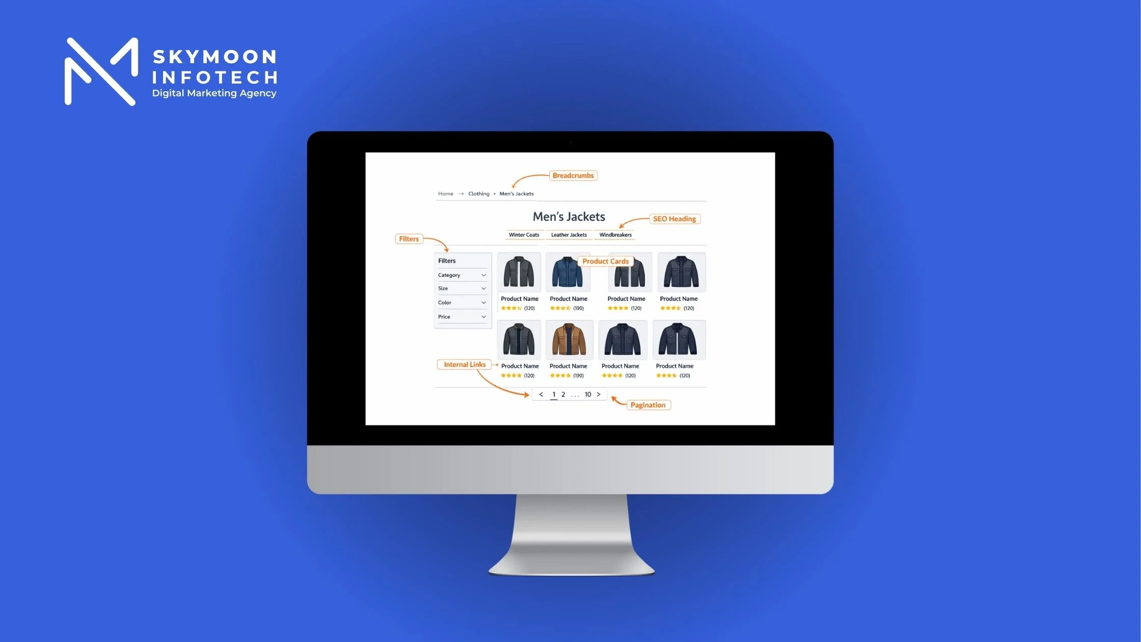
Simplify Navigation & Site Structure
Users should find what they’re looking for in three clicks or less. Keep menus clean, limit drop-down options, and add breadcrumbs for easy backtracking. A logical site structure reduces confusion and increases conversions.
Prioritize Page Speed & Core Web Vitals
Speed is one of the most overlooked user experience design tips to increase conversion. A one-second delay can reduce conversions by up to 7%. Optimize image sizes, leverage caching, and review your Core Web Vitals regularly to stay competitive.
Make CTAs Clear, Visible, and Compelling
Every page should have a primary action—whether it’s “Add to Cart” or “Book a Demo.” Use contrasting colors for CTA buttons, place them above the fold, and keep the text concise. Strong CTAs guide users naturally toward conversion goals.
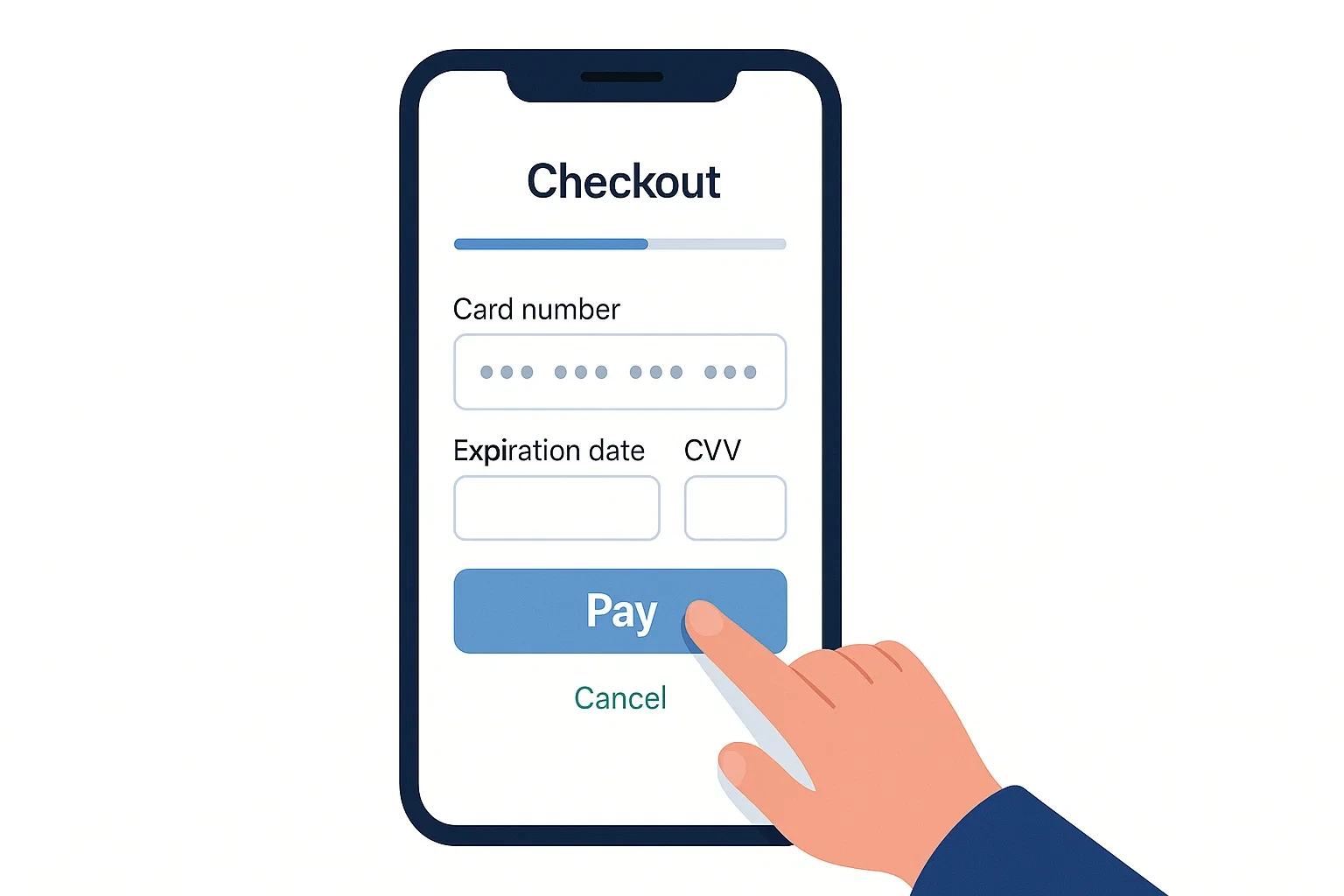
Keep Forms Short & User-Friendly
Long, complicated forms are a conversion killer. Ask only for essential information and use autofill where possible. Adding trust elements (like “We’ll never share your email”) reduces hesitation.
UX Best Practices for Conversions
Beyond the basics, certain UX best practices for conversions apply across all industries and website types. Following these principles ensures your design supports business goals and encourages users to complete desired actions.
Consistency in Design & Branding
Consistent typography, color schemes, and button styles reassure users that they are on a professional and trustworthy platform. Even minor inconsistencies—like different CTA styles—can create hesitation and hurt conversions.
Mobile UX and Conversions
With more than 60% of global traffic coming from mobile devices, optimizing mobile experiences is non-negotiable. Buttons should be large enough to tap, menus easy to collapse, and forms simple to complete. Good mobile UX and conversions go hand in hand.
Accessibility and Inclusivity
Accessibility features—like alt text for images, keyboard navigation, and high-contrast text—improve usability for all users. Not only does this build inclusivity, but it also signals trust and professionalism, boosting conversion rates.
Using Visuals & Whitespace Effectively
Crowded designs overwhelm users. Thoughtful use of whitespace guides attention to the most important elements—like CTAs—while high-quality visuals support clarity. This balance improves scannability and reduces friction in the conversion path.
Common UX Mistakes Hurting Conversions
Even small UX errors can derail a visitor’s journey and cost you potential revenue. Recognizing these UX mistakes hurting conversions is the first step toward fixing them.
- Cluttered layouts that overwhelm users with too many choices
- Poorly placed or hidden CTAs that confuse visitors
- Lengthy forms demanding unnecessary information
- Ignoring mobile UX and conversions, leading to frustration on smaller screens
- Lack of accessibility features such as alt text or proper contrast
- Slow-loading landing pages and checkouts
Landing Page UX Tips
Landing pages are often where conversions happen, so they deserve extra care. Some practical landing page UX tips include:
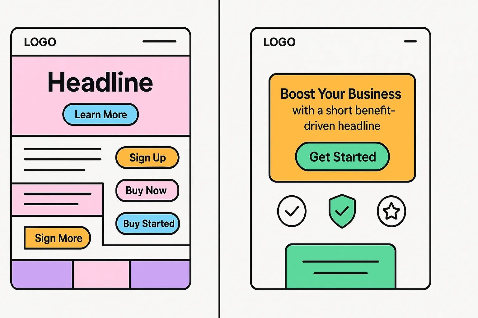
- Keep the message above the fold clear and benefit-driven.
- Use one main CTA instead of multiple competing options.
- Add trust elements such as testimonials, reviews, or security badges.
- Avoid clutter—guide the eye toward the next logical action.
By optimizing landing page UX, you can reduce bounce rates and move users further into the conversion funnel.
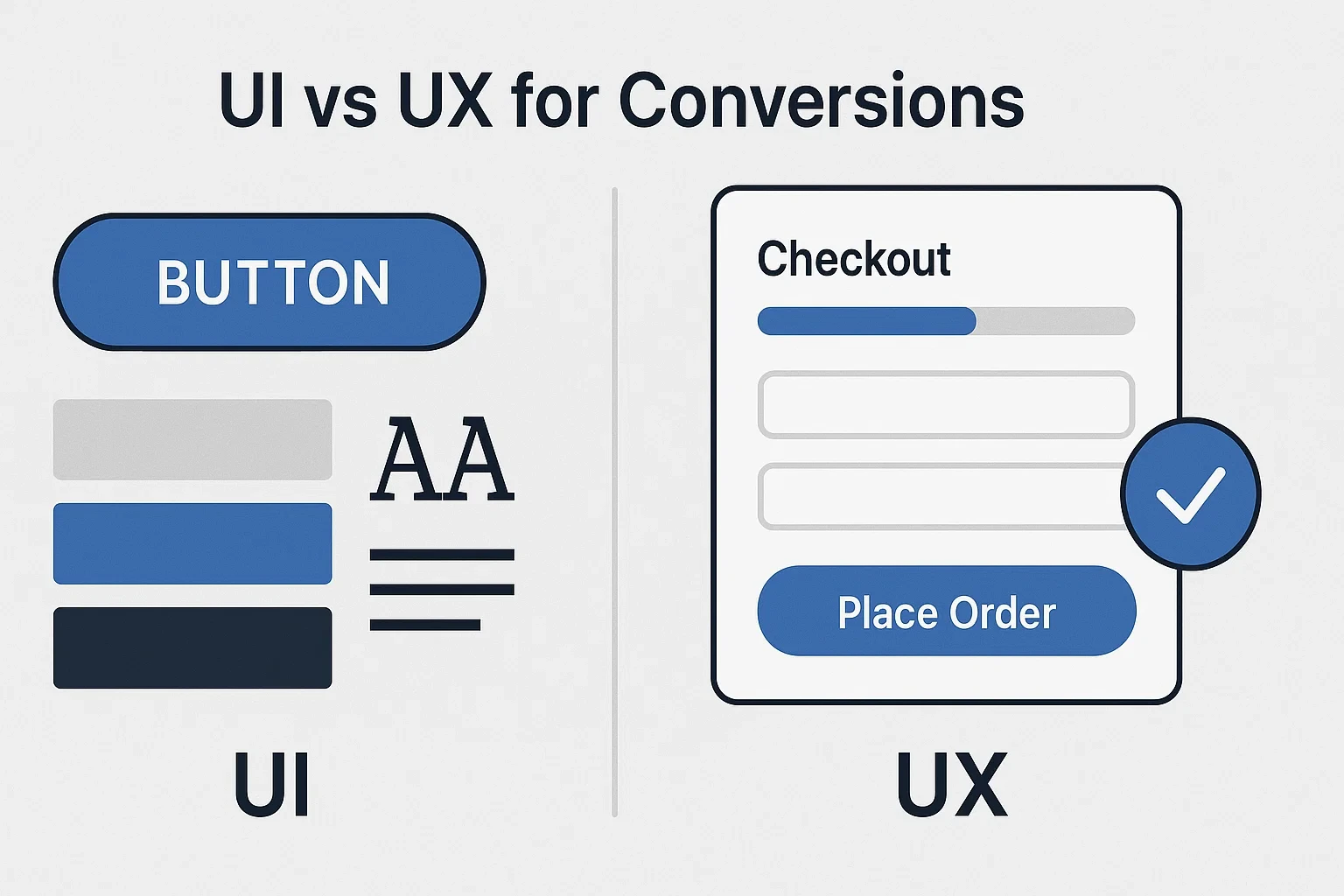
UI vs UX for Conversions
Many beginners confuse UI (User Interface) with UX (User Experience). While they’re related, they serve different purposes. UI vs UX for conversions is best understood as “look versus feel”: UI is how your website looks, while UX is how it works to guide users toward an action.
What UI Brings to the Table
UI focuses on colors, typography, buttons, and layout aesthetics. A polished UI creates a strong first impression, signaling professionalism and brand credibility. However, even the best UI cannot save a site with broken user flows.
Why UX Drives Conversions
UX ensures that every interaction is seamless and goal-oriented. From intuitive navigation to reducing form friction, UX removes barriers that prevent users from converting. CRO strategies succeed only when they sit on a foundation of strong UX.
Balancing UI and UX for Business Success
The best results come from combining UI and UX. Attractive buttons (UI) must also be placed logically (UX). Beautiful typography (UI) should also ensure readability across devices (UX). Together, they create a cohesive journey that drives conversions.

UX Audits and Continuous Improvements
A strong user experience isn’t a one-time project—it’s an ongoing process. Regular evaluations, known as a UX audit for conversion rate, help identify hidden barriers preventing users from converting. These audits ensure your website remains competitive, user-friendly, and aligned with changing customer expectations.
What Is a UX Audit?
A UX audit is a systematic review of your website’s design, navigation, and conversion funnels. It reveals issues such as confusing CTAs, unnecessary form fields, or slow-loading pages that reduce conversions.
Tools and Methods for UX Audits
To conduct a thorough audit, businesses often use:
- Heatmaps (e.g., Hotjar) to track user clicks and scroll behavior.
- Session recordings to observe real user journeys.
- Google Analytics to identify high-exit pages.
- Surveys and feedback forms to collect user insights.
These tools provide both quantitative and qualitative data to prioritize improvements.
When to Hire a UX Design Agency for CRO
While in-house teams can handle basic fixes, specialized agencies bring deeper expertise. Choosing to hire a UX design agency for CRO can accelerate results by combining design psychology, A/B testing, and advanced analytics. Agencies often create custom roadmaps that align UX improvements with business KPIs.
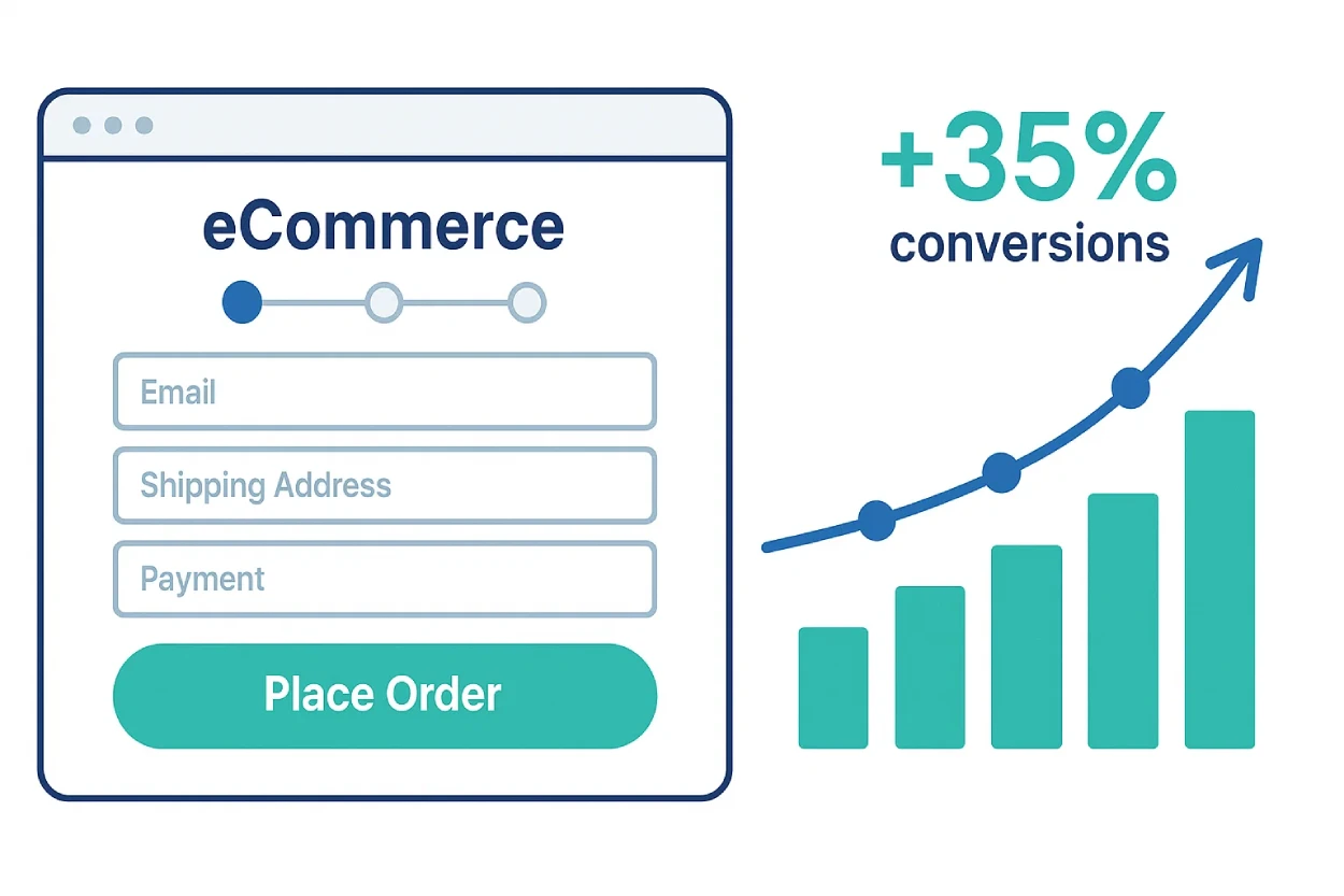
Real-World UX Improvements Case Study
Theory is valuable, but nothing proves the impact of UX better than real-world results. This UX improvements case study conversion example highlights how small design changes can lead to measurable business growth.
The Challenge
An eCommerce brand noticed a high cart abandonment rate—nearly 70%. Despite attracting traffic through paid ads, most users left before completing checkout. The team suspected UX roadblocks were the cause.
The Fix
The company launched a UX audit for conversion rate using tools like heatmaps and session recordings. Findings showed three major issues:
- Checkout forms were too long and asked for unnecessary details.
- The mobile site lacked a clear progress indicator.
- CTA buttons were small and hard to tap.
By simplifying the checkout form, enlarging CTAs, and adding a mobile-friendly progress bar, they removed friction points.
The Results
Within 60 days of implementing these changes, the business saw:
- A 35% increase in conversions.
- A 20% drop in cart abandonment.
- A notable rise in repeat purchases due to improved trust and usability.
This UX improvements case study conversion shows that addressing even a handful of UX issues can dramatically boost revenue.
Actionable UX Checklist for Beginners
To make this guide even more practical, here’s a simple beginner UX guide for higher conversions checklist. You can use it as a quick reference whenever you’re reviewing your website.
- Simplify navigation: Users should reach any page in three clicks or less.
- Prioritize page speed: Regularly test performance with Google PageSpeed Insights (DA 95+).
- Make CTAs bold and visible: Use contrasting colors and concise copy.
- Optimize forms: Ask only for essential information and enable autofill.
- Improve mobile UX and conversions: Ensure buttons are tappable, menus are collapsible, and checkouts are mobile-friendly.
- Keep design consistent: Maintain uniform fonts, colors, and layouts across all pages.
- Add accessibility features: Alt text, readable fonts, and proper contrast support inclusivity.
- Run regular UX audits: Identify roadblocks using heatmaps, analytics, and feedback surveys.
- A/B test improvements: Validate changes before rolling them out site-wide.
- Consider expert help: If conversions remain stagnant, hire a UX design agency for CRO to accelerate results.
This checklist ensures that even beginners can take structured action to improve conversion rate with UX without feeling overwhelmed.
Conclusion
Delivering excellent UX for better conversions is about more than aesthetics—it’s about removing friction, building trust, and guiding users toward meaningful actions. From simplifying navigation and forms to optimizing for mobile and running consistent audits, every improvement contributes to higher conversions.
By applying the strategies in this guide—avoiding mistakes, following UX best practices for conversions, and learning from real-world case studies—you can create user journeys that feel effortless and rewarding. Whether you’re just starting out or refining existing processes, remember that UX is a continuous investment.
If your business is ready to take the next step, consider a professional audit or even choosing to hire a UX design agency for CRO. Expert teams bring proven frameworks and data-driven insights that can unlock growth faster than trial and error.
Start optimizing today — your users will thank you.
FAQ
How can UX improve conversion rates?
UX eliminates friction in the user journey—through faster load times, intuitive navigation, and clearer CTAs—making it easier for visitors to complete desired actions.
What’s the difference between UI and UX in conversions?
UI is about design aesthetics (colors, typography, buttons), while UX focuses on usability and flow. UX ultimately drives conversions by guiding actions.
How often should I conduct a UX audit?
Ideally, perform a UX audit for conversion rate every quarter or after major site updates. Regular audits help catch small issues before they harm performance.
What are the biggest UX mistakes that reduce conversions?
Cluttered designs, hidden CTAs, long forms, poor mobile optimization, and ignoring accessibility are the most common UX mistakes hurting conversions.
Should small businesses hire a UX design agency for CRO?
Yes—especially if in-house expertise is limited. Agencies provide proven methods, testing frameworks, and faster results.