
Every guide to lead capture form optimization tells you to reduce fields to increase conversions. The contact form best practices service business owners need differ from e-commerce in one important way.
That lead quality vs lead volume form fields trade-off is real, but it is incomplete for a service business; but it is incomplete for a service business. At an e-commerce checkout, an extra submission is always net positive.
Turn more of your existing traffic into customers
Twenty checks across landing pages, calls to action, forms, and trust signals. No extra traffic needed, just a better funnel.
At a consulting firm, a home services company, or a legal practice, an unqualified enquiry costs a salesperson an hour of time, a follow-up call, and a frustrating conversation.
For service businesses, the goal is qualified enquiries per session, not submissions per session. That distinction changes several of the following 12 decisions.
These 12 decisions cover contact form conversion rate optimization at the field level: what to ask, whether to ask it, and what the trade-off costs.
How fields look, animate, or validate visually is a separate subject covered in form UX in detail. The page the form sits on, including hero copy and trust signals, is covered in the landing page around the form.
For the wider conversion picture beyond the form, that post covers site-level CRO. This post starts and ends with the form itself.
How Many Fields Should a Lead Form Have?
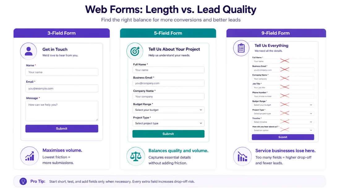
The right number of fields is the minimum your sales team genuinely cannot proceed without. Not three, not five; specifically what qualifies the lead or delivers the next step.
Adding a field beyond that minimum costs you conversions without improving lead quality. Removing a field below that minimum raises submission volume but fills your pipeline with people you cannot help.
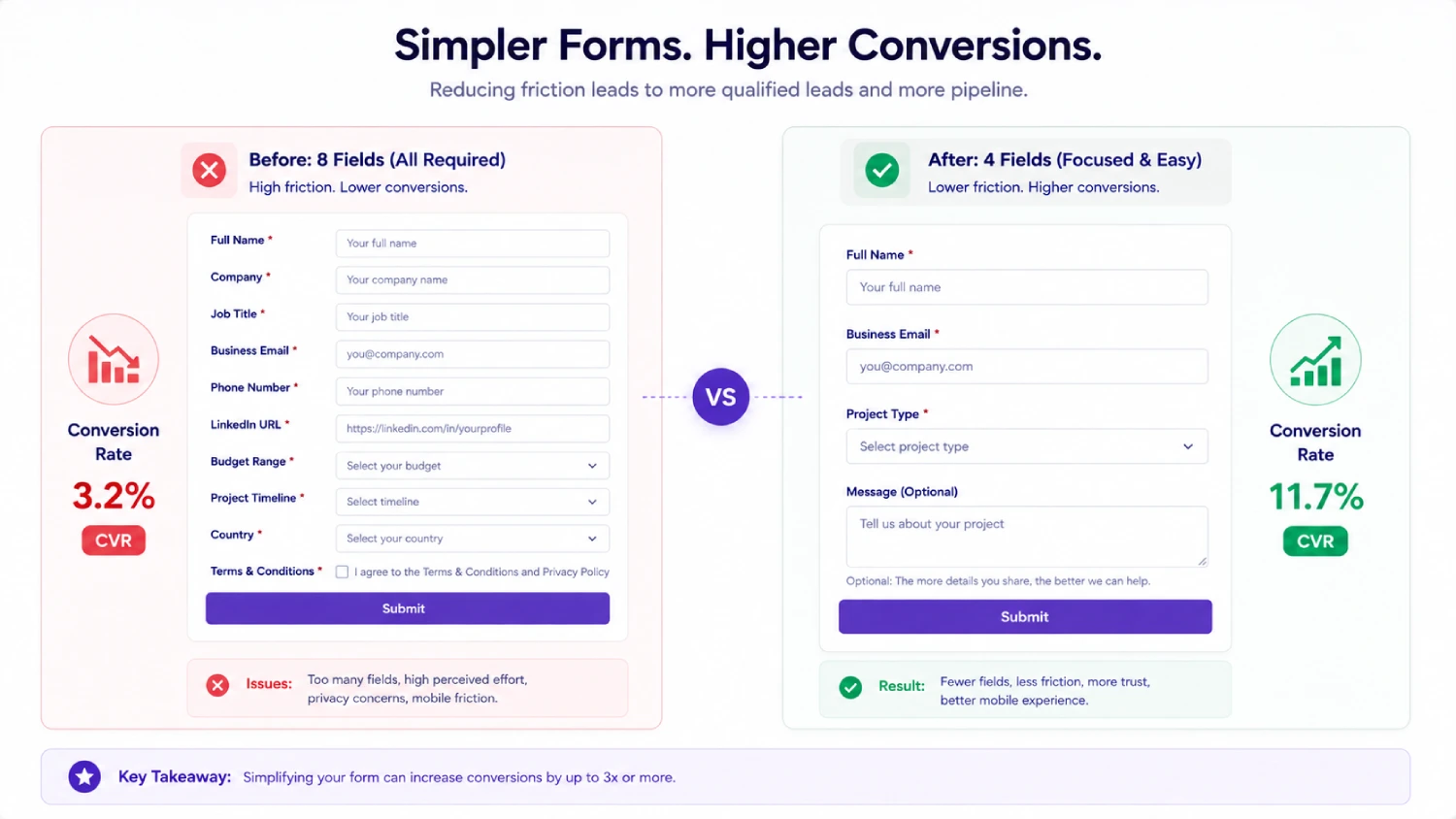
[DATA] Sleeknote analysis of 26,270 campaigns (2025): a single email field converts at 4.41%, two fields at 2.90%, three fields at 1.93%. Each added field costs roughly one-third of conversions.
Digital Applied 2026 benchmark data across 400+ forms: conversion drops modestly from 23.1% at 3 fields to 17.0% at 5 fields, then collapses to 11.4% at 7 fields.
The cliff is between 5 and 7 fields, where each additional field costs roughly 2.8 percentage points versus 1.5 points before it.
Three starting points by service type:
- Agency enquiry form: Name, Business email, Project description, Budget range; 4 fields. Phone and timeline are nice-to-have; add them only if your sales process genuinely requires a call before a proposal.
- Legal enquiry form: Name, Email, Matter type (dropdown), Brief description; 4 fields. The matter-type qualifier is worth its cost in conversion because it routes the lead before the first call.
- Home services quote form: Name, Phone, Service needed, Address/postcode; 4 fields. Phone is justified here because same-day callbacks are the sales model.
[SKYMOON INFOTECH ANALYSIS] In the contact forms we audit on client sites, the most common finding is a 7-field form on a page with no qualifying intent signal; the visitor has not read a price guide, has not seen a case study, has not indicated they are ready to buy.
A visitor at that point abandons a 7-field form at much higher rates than a visitor who has just read a detailed service page. The form length that works is determined by the page context, not by an industry benchmark.
Lead Form Optimization: The 12 Field Decisions
Each decision below follows the same structure: the choice being made, the argument for each side, and our recommendation with the condition under which it flips. A decision with no counter-argument is a tip. This is not a list of tips.
Decision 1: Name as One Field or Two
One field (“Full name”) versus two (“First name” and “Last name”). The two-field version lets you personalise follow-up emails with first name only. The one-field version reduces visible friction.
The difference is 1.5 to 2 percentage points in average conversion, per Zuko field-level data.
[OUR RECOMMENDATION] Use one field unless your CRM or email platform requires separate first and last name for personalisation. If you already use first-name personalisation in your follow-up sequences, the data quality is worth the extra field. If you do not, it is pure friction.
Decision 2: Business Email Only or Any Email
Requiring a business email (blocking Gmail, Yahoo, Hotmail addresses) raises lead quality in B2B SaaS and enterprise agency contexts but penalises legitimate freelancers and sole traders who use personal email addresses.
In a service business with a high ticket value and a long sales cycle, the quality gain is usually worth the volume loss. In a home services business or a dental practice, blocking personal emails removes most of your addressable market.
[OUR RECOMMENDATION] Require business email only if your average contract value is above $5,000 and your sales cycle exceeds two weeks. Below those thresholds, accept any valid email and qualify by other means.
Decision 3: Phone Required, Optional, or Absent
The phone number field is the highest-friction field on most lead forms after the password field. Zuko Analytics data shows phone as one of the two highest-abandonment fields, with a case study finding that requiring a phone reduced conversions by 47%.
Changing the phone field from mandatory to optional dropped abandonment from 39% to 4% in MarketingSherpa data.
The counter-argument: if your sales process is phone-led and your team calls every lead within 24 hours, requiring a phone number filters for leads who expect a call.
An uncontactable lead who never answers is worse than no lead at all for a business with a phone-dependent closing process.
[OUR RECOMMENDATION] Optional phone field with stated reason: “We call within 24 hours to discuss your project.” Required phone only if your sales model is genuinely phone-first and your team actually calls within 24 hours.
Absent if your qualification happens through email and the lead never needs to hear from you by phone before the proposal.
Decision 4: Budget or Timeline Qualifier
A budget or timeline question is the field with the highest qualification value for a service business and the highest abandonment risk for a casual visitor. An agency that only works on projects above $10,000 benefits from a budget dropdown that surfaces in the first interaction.
A visitor who is still in early research mode abandons at a budget question because it feels premature.
The middle path: use a range dropdown rather than a free-text budget field. “Under $5,000 / $5,000-$20,000 / Over $20,000 / Not sure” is less threatening than a blank field labelled “Budget ($).” Including a “Not sure” option removes the disqualifying effect on genuine prospects who have not yet scoped the work.
[OUR RECOMMENDATION] Include a budget range dropdown if your sales team immediately qualifies leads by budget and you have a defined minimum project size.
Make it optional if you want the lead but the budget conversation happens on the first call. Skip it entirely if your proposition does not have a meaningful minimum.
Decision 5: Free-Text Message Box or Structured Dropdown
A free-text “Tell us about your project” field signals that you want genuine enquiries. It also allows a visitor to self-express in a way that helps your team qualify the lead before the first contact. The cost: it adds perceived effort and works poorly on mobile.
A structured dropdown (“What service are you looking for?”) routes the lead automatically and reduces the text input burden.
The cost: it fails to capture context that changes how your team approaches the call, and the options may not match the visitor’s actual need.
[OUR RECOMMENDATION] Free-text message box for service businesses with long or complex engagements where lead context materially changes the response. Structured dropdown for standardised service lines where routing matters more than context.
Hybrid: a required dropdown for routing plus an optional free-text field for context is the best of both but adds one more visible element.
Decision 6: Company Name or Job Title
Company name tells you the organisational context. Job title tells you the decision-making authority. For B2B services where the company matters more than the individual (enterprise software, commercial property, corporate legal), company name is worth asking. For B2B services where the seniority of the contact determines the sale (consulting, board advisory, C-suite executive search), job title matters more.
[OUR RECOMMENDATION] Ask company name if your sales team segments by company size or industry before the first call. Ask job title if your sales team qualifies by seniority.
Do not ask both unless your CRM genuinely uses both for routing. If you are enriching contact records automatically, you may not need to ask either; the enrichment tool pulls it from the email domain.
Decision 7: Single-Step or Multi-Step Form
The commonly cited “300% more conversions from multi-step forms” figure traces to a self-reported case study published by Venture Harbour on their own website, describing the performance of a product they were selling (Leadformly). It is not a controlled experiment and should not be repeated as a general law.
[DATA] What the evidence actually shows: Formstack data puts multi-page forms at 13.9% versus single-page at 4.5% for matched form types. Zuko tests find two-step forms performing 14% better than single-page for the same field set.
Venture Harbour’s own site went from 0.96% to 8.1% over five years of iteration; the multi-step format was one of several changes made. The 300% figure is a best-case outcome from an optimised multi-step form versus an unoptimised single-step form, not a guaranteed lift.
The decision rule by field count:
You already have the traffic. Are you converting enough of it?
Most websites convert a small fraction of the visitors they get. A free review shows you exactly what is stopping the rest from becoming customers.
No commitment, just a clear picture of where you stand.
| Total Fields | Single-Step vs Multi-Step | Reasoning |
|---|---|---|
| 3-4 fields | Single-step — default | Multi-step adds friction without hiding much |
| 5-7 fields | Either — test with your audience | Multi-step may reduce perceived length; single-step is simpler to implement |
| 8+ fields | Multi-step — strongly recommended | Full form is intimidating; chunking into 2-3 steps is the primary benefit |
| High mobile traffic | Multi-step for 5+ fields | Scrolling a long form on mobile is a specific friction point multi-step resolves |
[OUR RECOMMENDATION] Use single-step for any form with under 7 fields and primarily desktop traffic. Use multi-step when total field count is 7 or more, or when mobile accounts for over 60% of form sessions.
Do not switch to multi-step to fix a volume problem caused by an offer that does not convert; the format change cannot overcome a proposition mismatch.
Decision 8: What the Submit Button Says
“Submit” is the lowest-converting button label in consistent testing. It is a command with no implied benefit. “Get my free quote,” “Book a call,” “Send my enquiry,” or “Start your project” each name the action from the visitor’s perspective and imply a next step.
[OUR RECOMMENDATION] Never use “Submit.” Use a label that names what happens next and uses first-person possessive where it fits. If the next step is a callback, say so: “Book a callback.”
Test button label as part of any form A/B test; it is low-cost to change and frequently the highest-impact single edit.
Decision 9: Label Placement: Above Field or Inside (Placeholder)
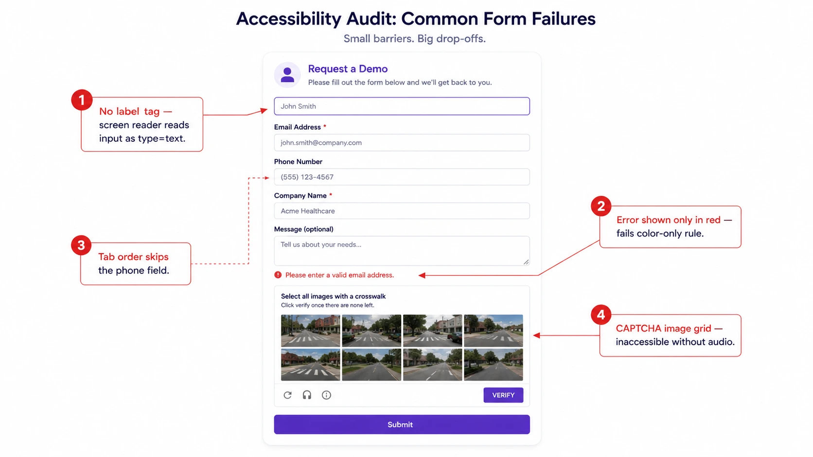
This is one of the few form field questions with a settled answer. Labels placed above the field are superior to placeholder-only labels in every documented study. Placeholder text disappears on focus, leaving the user unable to review what they have typed against the prompt.
Placeholder-only labels also fail screen-reader expectations and are among the most cited accessibility failures in WCAG audits. For the visual detail on label styling and floating label implementation, see form UX in detail.
[OUR RECOMMENDATION] Labels above the field. Floating labels (which start inside the field and animate above on focus) are an acceptable visual compromise. Placeholder-only labels for anything other than a search box are a conversion and accessibility failure.
Decision 10: Inline Validation Timing
Validate on blur (when the user moves away from a field), not on keystroke. Keystroke validation marks fields as wrong while the user is still typing, creating a hostile experience.
Post-submission-only validation forces the user to re-read the entire form to find errors. Blur validation is the settled middle ground. For implementation detail and error message copy patterns, see form UX in detail.
Decision 11: Consent and Privacy Line
For a contact form that responds to the enquiry itself (no marketing emails, no remarketing), a consent checkbox is not required by the GDPR for EU/UK visitors; responding to a contact is a legitimate interest.
For anything beyond that (adding the contact to a marketing list, using the email for retargeting, sharing the data with a partner), explicit unticked consent is required.
In the US, there is no equivalent federal mandate, but a visible privacy line (“We’ll never share your details”) measurably reduces abandonment by lowering perceived risk.
[LEGAL/PRIVACY NOTE] The above is general information, not legal advice. Jurisdiction-specific requirements vary, and the GDPR distinction between legitimate interest and consent is subject to interpretation by different supervisory authorities. Review your specific data handling with qualified legal counsel.
[OUR RECOMMENDATION] Always include one line of privacy copy below the submit button, even where a checkbox is not required. “We respond within 24 hours and never share your details” combines a response-time commitment with a privacy signal.
For any form that results in marketing contact, a separate clearly-worded unticked consent checkbox is required for EU/UK traffic.
Decision 12: Spam Defence Choice
Spam submissions are a lead quality problem, not only a data hygiene problem. A form that returns 40% spam inflates submission counts and makes it harder to identify real leads.
The conventional solution, a CAPTCHA, solves the problem and introduces a new one: honeypot and CAPTCHA data shows honeypots catch 80-90% of basic bot submissions with zero friction for real users, while CAPTCHA reduces legitimate form completions by 3-4% on average.
Google reduced reCAPTCHA’s free tier from 1 million to 10,000 assessments per month in early 2025, adding a cost dimension to the decision.
Recommended spam defence in priority order:
- Layer 1: Honeypot field (hidden input that real users never see; bots fill it; submission is discarded). Zero friction, catches 80-90% of basic automated bots.
- Layer 2: Time-on-form threshold. Bots complete forms in under 2 seconds; a minimum submission time of 3-5 seconds discards most automated submissions without any user-visible check.
- Layer 3: Invisible challenge (Cloudflare Turnstile or reCAPTCHA v3). Runs behavioral analysis in the background; shows a visible challenge only for genuinely suspicious sessions. Fractional friction compared to reCAPTCHA v2 image grids.
- Layer 4: Visible CAPTCHA (reCAPTCHA v2 image grid). Last resort. 3-4% conversion drop. Justified only when honeypot and invisible challenges are not sufficient for your traffic volume and spam rate.
[OUR RECOMMENDATION] Start with honeypot plus time threshold. Add Cloudflare Turnstile if spam persists. Deploy visible CAPTCHA only on forms under sustained bot attack.
Never deploy visible CAPTCHA as a first-line defence on a low-volume service business contact form where a 3% conversion drop costs real leads.
Form Accessibility: Labels, Errors, and CAPTCHA Alternatives
Form accessibility is a compliance issue in the US (ADA) and EU (European Accessibility Act, enforced from June 2025) and a conversion issue everywhere.
Inaccessible forms are abandoned by screen-reader users, users with motor impairments, and users navigating by keyboard.
- Label association: every input element must have a programmatically associated label using the for/id attribute pair or aria-label. Placeholder-only labels fail this requirement.
- Error messages: errors must be communicated in text, not only by colour. “This field is required” must appear as visible text, not only by turning the field border red.
- Keyboard navigation: every form element must be reachable and operable by keyboard alone, in a logical tab order. Multi-step forms must not trap keyboard focus at the step boundary.
- CAPTCHA alternatives: image-grid CAPTCHAs are inaccessible to users with visual impairments. The alternatives in Decision 12 (honeypot, time threshold, invisible challenge) also solve the accessibility problem. This is why CAPTCHA should be a last resort on form accessibility grounds as well as on conversion grounds.
AI-Assisted and Conversational Forms: When They Beat a Static Form
Conversational forms (chatbot-style, one-question-at-a-time interfaces) and AI-assisted forms (predictive field completion, dynamic question routing based on previous answers) are genuine improvements under specific conditions. They are not a universal upgrade.
Conversational forms beat static forms when total field count is high enough that the progressive reveal reduces perceived effort, when the business sells a complex service where a question-and-answer structure naturally maps to the sales discovery call, and when mobile is the primary session device.
They perform worse than static forms when the visitor has high intent and wants to submit quickly; a single-purpose contact form on a pricing page serves a visitor who has already decided and wants friction removed, not engagement added.
AI-assisted field prediction (auto-completing company name from business email domain, pre-filling job title from LinkedIn, suggesting service type from page context) reduces the number of fields the visitor actively completes.
The conversion benefit is real and measurable. The implementation requirement is a data enrichment API in the form backend, which adds cost and integration complexity that most service businesses with under 500 monthly enquiries cannot justify.
[OUR RECOMMENDATION] Use conversational form format for discovery-stage enquiries where high field counts are unavoidable. Keep static forms for high-intent, low-field quote request forms.
Add AI field prediction only when form completion data shows that specific fields have high abandonment and your stack can support a data enrichment integration.
Measuring Form Performance: Beyond Submission Count
Submission count is not a performance metric for a service business. It is a vanity metric. The metrics that correspond to revenue are: qualified enquiry rate (submissions that meet your minimum criteria), lead-to-proposal conversion (enquiries that become proposals or calls), and contact rate (submissions where you successfully reach the person).
[DATA] Ruler Analytics 2026 (110 million sessions, 5 million conversions, 13 industries): average form conversion rate 5.13% across all form types. Digital Applied 2026 benchmark: demo request and quote forms average 4.6% to 6.9%; contact forms with lower commitment average 17-32%.
Zuko Analytics 2026: roughly two-thirds of users who start a form complete it; the view-to-completion rate including users who never interact drops below 50%.
Form abandonment rate benchmarks: roughly 55% of people who view a form abandon it without submitting (Zuko 2026 data).
To see where specifically users abandon your form, session recording and form analytics on individual fields is the right tool. For how to set that up, see how to see where users abandon the form.
For industry-specific form audits, the healthcare CRO audit checklist covers the same measurement methodology applied to a specific vertical.
Audit your form against your own trailing 12 months rather than a published benchmark; a legal enquiry form and an agency project form are not comparable, even within the same conversion rate range.
A Note on India and Mobile-First Form Behaviour
In India, mobile accounts for 85-90% of web traffic across most service categories. A form that converts at 15% on desktop may convert at 4-5% on mobile if it has not been tested on a mid-range Android device at 4G speeds.
The field decisions above apply without modification on mobile; the field count recommendation is the same, the phone number decision is the same.
The differences are execution: tap targets should be minimum 48px, multi-step layout is more appropriate once field count exceeds 5, and auto-fill support for Indian mobile keyboards (particularly for name and address fields) should be verified in testing rather than assumed.
Phone number is genuinely more expected and less friction-producing as a required field in India than in a US context, where cold calling norms differ.
Frequently Asked Questions
How many fields should a lead capture form have?
The right number is the minimum your sales team genuinely cannot proceed without; not a benchmark figure. Every field must earn its place by either qualifying the lead or enabling the next step.
The Sleeknote dataset of 26,270 campaigns shows each added field costs roughly one-third of conversions. Three to five fields is the working range for most service business contact forms.
Do multi-step forms actually convert better than single-step forms?
In the right context, yes. The commonly cited 300% figure comes from a single vendor case study on their own website and should not be treated as a general law.
Ready to turn this into an actual growth plan?
Our team builds strategies across SEO, paid advertising, AI search visibility, and website performance, matched to your budget and your goals, not a generic package.
- A real thirty minute call, not a sales pitch
- Recommendations specific to your business
- A short list of what to fix first
What is defensible: Formstack data shows multi-page forms at 13.9% versus single-page at 4.5% for matched form types.
Multi-step is worth testing when total field count exceeds 7 or when mobile accounts for the majority of sessions. For a four-field form, single-step is simpler and usually performs comparably.
Should I ask for a phone number on my lead form?
It depends on whether your sales process is phone-led. Requiring a phone number reduces submissions by roughly 47% in tested cases (Zuko Analytics, MarketingSherpa data).
Making it optional rather than required typically drops abandonment from 39% to 4%. If your team calls every lead within 24 hours, require it and say so.
If no one calls within a working day, the field is pure friction; remove it.
Does CAPTCHA hurt conversion rates?
Yes, measurably. Baymard Institute and Bouncer data put the average conversion drop from visible CAPTCHA at 3-4%. A honeypot field catches 80-90% of basic bots with zero friction and should be the first line of defence.
Add Cloudflare Turnstile (invisible challenge) as a second layer before deploying a visible CAPTCHA. A visible CAPTCHA is a last resort, not a default.
Why am I getting lots of form fills but no real enquiries?
Diagnose in order: the form is too easy relative to the offer and attracts unqualified visitors; the offer attracts non-buyers regardless of form design; no qualifying field exists (no budget range, no project type); or bot and spam traffic inflates the count.
Fix: add one qualifying field and measure the ratio of qualified enquiries to total submissions, not the submission count.
What is a good form conversion rate for a service business?
Ruler Analytics 2026 puts the average form conversion rate at 5.13% across 13 industries. A high-intent quote request form on a service pricing page converting at 6-8% is performing well.
A form on a blog sidebar converting at 1-2% may be doing exactly what it should for that traffic intent. The industry benchmark data is a starting point, not a target.
Measure against your own trailing baseline and against qualified enquiries, not raw submissions.
Should form labels go above the field or inside it as placeholder text?
Above the field. Placeholder text disappears on focus, leaving the user unable to review what they have typed against the prompt.
It also fails screen-reader requirements and is one of the most common WCAG violations on contact forms. Floating labels, which animate above the field on focus, are an acceptable visual compromise.
Placeholder-only labels are a conversion and accessibility failure.
Do I need a consent checkbox on my contact form?
For EU/UK traffic, responding to a contact enquiry is a legitimate interest under the GDPR and does not require explicit consent.
Adding the contact to a marketing list, or using their data for retargeting, requires an explicit unticked consent checkbox. In the US, there is no equivalent federal requirement, but a visible privacy line reduces abandonment.
This is general information, not legal advice; verify your specific obligations with qualified counsel.
Is progressive profiling worth setting up for a small business?
Usually not for small service businesses. Progressive profiling forms require a CRM that recognises returning visitors and suppresses fields already collected.
For most service businesses with under 10,000 monthly sessions, the return-visit rate is too low and the CRM integration too complex to generate a measurable lift.
The threshold at which it starts to pay: consistent return traffic, a CRM with native progressive profiling support (HubSpot, Pardot), and a sales cycle long enough that a visitor genuinely returns multiple times before converting.
Implementing These Decisions
A practice manager or founder can run through all 12 of these decisions in a single afternoon; the decisions are not technically complex. What requires more time is running the A/B tests that validate which choices are right for your specific audience and offer.
If you want structured support running those tests across your full conversion funnel, the CRO service page covers how Skymoon approaches form optimisation alongside landing page and funnel analysis.
Let's turn this into results for your business.
SEO, paid advertising, AI search visibility, website design, and conversion optimization, all under one roof, all pointed at the same goal: revenue.