
Most landing page guides in 2026 give you a list of tips. This one gives you the evidence behind them – conversion rate benchmarks by industry, the design decisions that move the number, and the A/B testing rules that produce results you can actually trust.
Whether you are building a landing page from scratch, diagnosing why a live page is underperforming, or briefing a CRO agency, the sections below are structured to answer the specific question you came with.
Turn more of your existing traffic into customers
Twenty checks across landing pages, calls to action, forms, and trust signals. No extra traffic needed, just a better funnel.
The landing page best practices in this guide cover design, structure, message match, and measurement for service businesses, B2B lead generation, SaaS, and D2C.
Contact form fields, general UX principles, and site-wide CRO are each a separate topic – this guide links out to those where relevant and does not duplicate them.
Two facts worth knowing before you read the benchmarks: the cross-industry median conversion rate on a landing page is 6.6%, based on Unbounce’s analysis of 41,000 pages.
And traffic source is a bigger variable than industry; the same page converts at a 19.3% median from email and 10.9% from paid search. Both figures appear in the benchmark table below, with source and year.
What Is a Landing Page? (And How It Differs from a Homepage)
A landing page serves one intent and links only to its own conversion action. A homepage serves many intents and links outward to multiple destinations. That distinction is the entire design brief.
Every decision in a landing page, from navigation removal to CTA placement to form length, follows from it. If a page has more than one goal, it is not a landing page.
The practical test: count the number of distinct actions a visitor can take. A landing page has one. If yours has three, it is a home page with a campaign URL.
The conversion rate gap between single-goal pages and multi-goal pages is not marginal. Unbounce data from 41,000 landing pages shows single-CTA pages convert at 13.5% against 10.5% for pages with five or more links.
That 3-point gap across meaningful traffic volume is the cost of a navigation menu left in place.
What Is a Good Landing Page Conversion Rate? Benchmarks by Industry (2026)
The page you are on currently contains zero percentage figures. That is the clearest single reason it loses citation share while impressions grow. Every figure below carries a named source and a year because benchmarks without context are misleading.
[DATA – SOURCED] Source for all industry median figures: Unbounce Conversion Benchmark Report Q4 2024. Dataset: 41,000 landing pages, 464 million visits, 57 million conversions.
Median is used (not mean) to avoid outlier skew. Top-quartile threshold sourced from WordStream and Backlinko January 2026 analysis of the same Unbounce dataset.
| Industry / Vertical | Median CVR | Top Quartile | Notes |
|---|---|---|---|
| All industries (cross-sector median) | 6.6% | 11.45%+ | Unbounce Q4 2024, 41,000 pages. The number most marketers cite incorrectly as a target. |
| Events and entertainment | 12.3% | 20%+ | Highest median of any tracked industry. Low commitment ask (free registration) plus urgency. |
| Financial services | 8.4% | 14%+ | High consumer intent; compliance-driven clarity in messaging correlates with higher CVR. |
| B2B (lead generation, consultations, demos) | 5.0-13.3% | 18%+ | Wide range by offer type. Free audit or demo pages convert above the cross-sector median when well-targeted. |
| Legal services | 5.1-7.4% | 12%+ | High-intent, urgent need. Short form with phone field outperforms long contact form. |
| SaaS / technology | 3.8% | 8-15% | Lowest median of any tracked vertical. High SKU complexity; free-trial pages at top of range. |
| Ecommerce (product purchase) | 3.7% | 8%+ | Lower than lead-gen pages because purchase commitment is higher than a form submit. |
| Healthcare / wellness (lead gen) | 5.0-8.0% | 12%+ | Sensitive category; trust signals above the fold are disproportionately impactful. |
[NOTE] Traffic source moves the number more than industry does. Unbounce found email traffic converts at a median 19.3%, paid social at 12%, paid search at 10.9%, and display at 4.1%, for the same landing pages.
Benchmark your page against the relevant traffic source before comparing to an industry table.
The practical test: if your page sits below 3% conversion rate on warm traffic (email or branded search), something structural is broken, and it is almost always one of five things: a value proposition that does not match the ad that drove the click, a form with too many fields, competing CTAs, missing or wrong-positioned social proof, or a page load time above 3 seconds. These are fixable. The benchmark is a diagnostic tool, not a report card.
Landing Page Types: Which Architecture Fits Your Goal
Not all landing pages serve the same job. A click-through page for a SaaS product trial requires a different architecture than a lead-gen page for a B2B agency.
Matching page type to offer type is the structural decision that sets the ceiling for every other optimisation you make.
| Page Type | Primary Goal | Typical Offer | Median CVR Range | Key Design Constraint |
|---|---|---|---|---|
| Lead generation | Capture contact details | Free consultation, audit, demo, guide, webinar | 5-12% | Form placement: above fold or anchored at decision point. Field count: minimum to qualify. |
| Click-through | Warm visitor before purchase | SaaS free trial, product page, checkout | 8-15% | No form. One CTA button. Navigation removed. Value prop then button. |
| Squeeze page | Single-field email capture | Newsletter, email course, waiting list | 15-30% | Maximum one field. Minimal copy. No escape route. |
| Sales page | Direct purchase (long-form) | High-ticket offer, course, programme | 1-5% | Long form justified by price. Proof, objection handling, risk reversal essential. |
| Pitch / investor page | Credibility and enquiry | Partnership, agency pitch, round raise | 3-8% | Social proof heavy. Named clients. No pricing. |
| SaaS trial / free plan | Product-led growth entry | Free tier, 14-day trial | 3.8% median | Reduces friction to one click. Value prop must address the switching cost. |
| Webinar registration | Event sign-up | Live or recorded event | 20-35% | Time-bounded urgency. Speaker proof. Minimal fields. |
| Ecommerce product / category | Purchase or upsell | Physical or digital product | 3.7% median | Images essential. Reviews above fold. Buy button persistent on mobile scroll. |
B2B Landing Page Best Practices: Design for Sceptics
B2B visitors arrive at landing pages with higher scepticism, longer buying committees, and more reasons to leave than B2C visitors.
The design decisions that lift B2B conversion rates are different in emphasis from a consumer page, though not in kind.
Visual Hierarchy and Scan Patterns for B2B Audiences
Nielsen Norman Group’s landmark 2006 eye-tracking study of 232 users across thousands of web pages established the F-shaped reading pattern: users scan horizontally across the top, drop down and scan a shorter horizontal line, then move vertically down the left edge.
The 2020 follow-up research clarified that the F-pattern is a failure state, not an ideal: it emerges when headings are weak, paragraphs are dense, and there is no visual hierarchy to anchor the eye.
For B2B landing pages, the implication is precise: a page that fails to hold a buyer’s attention in the first horizontal sweep will never recover it. See Nielsen Norman Group’s F-pattern research for the full eye-tracking dataset.
The Z-pattern describes the scan on a visually structured page: across the top, diagonally down-left to the centre-left, then across the bottom.
For a B2B landing page with a clear above-the-fold section, CTA positioned at the Z’s endpoint (bottom-right or centre-bottom) consistently outperforms left-aligned CTA placement on minimalist layouts.
The principle: align your primary conversion element with where the eye arrives naturally, not where the designer placed it.
B2B-specific applications:
- Front-load the headline with the outcome, not the process. “We run your PPC campaigns” lands below a page that opens with “Your cost per qualified lead is too high. Here is what we do about it.”
- Place named client logos or proof within the first two viewport heights. B2B buyers in 2026 are trained by AI-generated content to scan for named evidence immediately. A logo bar below the fold does not help.
- Single dominant CTA, repeated. The same action button appearing at the top, middle, and bottom of the page outperforms a page with one CTA at the end. The visitor should never have to scroll back up to act.
B2B Landing Page Design Tips: What the Data Says
B2B conversion rates on lead-generation pages typically sit between 5% and 13.3% depending on traffic temperature and offer type.
SaaS landing page best practices differ from B2B services because the commitment is lower: the SaaS vertical sits at 3.8% median but free-trial pages with clear CTAs reach 8-15%.
The gap between a 5% and 13% conversion rate on a page receiving 500 monthly visits is 40 additional qualified leads per month at no increase in ad spend. The levers that drive that gap consistently:
[DATA – SOURCED] Social proof at the decision point increases conversion by up to 34% when positioned next to the form (Invesp, 2024). Testimonials with named individuals, job titles, and photos outperform anonymous quotes.
Logo bars from recognisable brands outperform generic “trusted by” text. The threshold: one named client your prospect has heard of matters more than ten they have not.
- Message match with the ad or link that sent the visitor: the headline on the page must match the promise of the click. A PPC ad that says “Free SaaS landing page audit” landing on a page that says “Grow your business faster” destroys conversion regardless of how good the page design is.
- Above-the-fold value proposition: state in one sentence what the visitor gets, for whom, and what makes it different. Not a tagline. Not a mission statement. The specific outcome delivered to the specific buyer.
- Form position: above the fold on high-intent paid traffic; at the decision point (after proof and before the close) on colder content or social traffic. The form should appear where the visitor has enough information to make the commitment the form requires.
Landing Page Structure: Section Order for Maximum Conversions
The section order below applies to a lead-generation landing page for a service business. Sales pages and click-through pages follow modified versions. The ordering principle: give the visitor enough information to trust the commitment before asking for it.
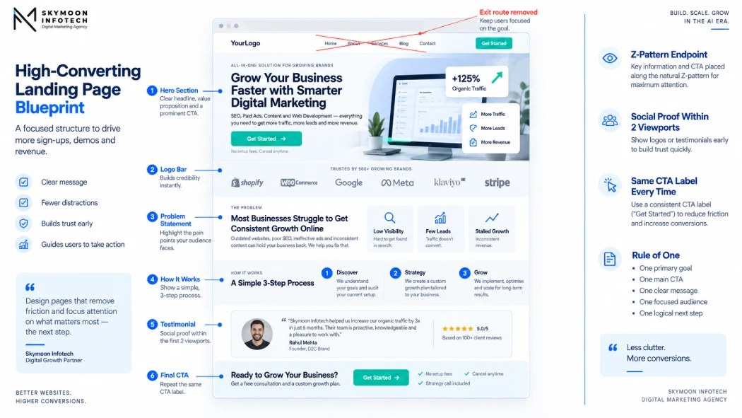
- Hero section: headline with value proposition, one-sentence qualifier of who it is for, primary CTA button. This is the Z-pattern landing point. The CTA here should be the same label as every CTA below it.
- Social proof cluster: named client logos, a specific testimonial with name and title (not “Marketing Manager, UK company”), or a quantified result from a named source. Position within the first two viewports.
- Problem or outcome framing: state the problem the visitor has or the outcome they want. Not features. Not process. The buyer’s situation in their language.
- How it works: a 3-5 step explanation of what happens when they submit the form or take the action. Remove ambiguity about what they are committing to.
- Objection handling: address the two or three reasons the visitor is not converting. For B2B services: timeline concerns, commitment anxiety, uncertainty about fit. For ecommerce: returns, guarantees, delivery.
- Secondary proof: detailed case result (if publishable), named testimonial cluster, or trust signal row (certifications, press logos, partner badges).
- Final CTA: repeat the primary action. Add a low-friction alternative if relevant (e.g., “Not ready? Download the guide” next to “Book a call”).
Landing page best practices remove navigation from pages built for paid campaigns: it is the structural decision with the most consistent evidence behind it.
In a VWO-documented A/B test, removing the navigation menu from a landing page increased conversion from 3% to 6%, a 100% lift on the same traffic. The mechanism: every navigation link is an exit route. A visitor who clicks away to the “About” page does not return to convert.
[DATA – SOURCED] VWO case study (Yuppiechief): navigation removal doubled conversion rate from 3% to 6% in an A/B test. This is a single-site case study, not a meta-analysis.
The direction is consistent with the structural principle (fewer exit routes = fewer exits), but the magnitude varies by traffic temperature. Cold paid traffic sees larger nav-removal lifts than warm branded traffic.
What is the rule of one landing page design principle? The rule of one is the structural principle that encodes this: one audience, one offer, one CTA, one desired outcome.
Each element of the page hierarchy tests against this rule. If a page has two headlines, two forms, or two offers, it has broken the rule and the conversion rate reflects it.
Landing Page Conversion Rate Optimization: Prioritising What to Fix
Landing page conversion optimization and general CRO follow the same principle: fix the element that blocks the most visitors first. The order in which you fix landing page problems matters as much as what you fix. Start with elements that touch every visitor, and work down to elements that only affect visitors who were already close to converting.
Landing Page CRO: The Priority Order for Fixes
- Message match with the traffic source: fix this before anything else. A visitor who clicks “free SaaS audit” and lands on a homepage is gone. The headline must mirror the ad language, or the conversion rate cannot improve regardless of what else you do. This is the lever that touches 100% of visitors.
- Above-the-fold value proposition: the clearest statement of what the visitor gets, for whom, and what makes it different. If a visitor cannot identify this within 5 seconds of landing, they will not scroll to find it.
- Form fields and placement: reduce to the minimum that qualifies the lead for your follow-up process.
- CTA label and positioning: the button label should name what happens next, not command a generic action.
- Page speed: a 1-second improvement in mobile load time produces a 20% lift in conversion rate (Google PageSpeed analysis). Below 2.5 seconds on mobile is the target.
- Social proof placement: move testimonials and logos from the bottom of the page to immediately above or beside the form.
- Everything else: headline testing, colour variants, layout experiments.
[SKYMOON INFOTECH ANALYSIS] In CRO audits on new client accounts, the most consistent finding is a page that has gone through extensive design iteration on colour schemes, hero images, and button colours, while the headline still does not match the ad that drives 80% of the traffic.
The design layer is polished; the message layer is broken. CRO that does not start with message match wastes the budget that paid for the traffic.
Message Match: PPC and Google Ads Landing Page Best Practices
Message match is the most impactful single element of a landing page for paid traffic, and the most commonly broken one. When a visitor clicks a paid search or social ad and lands on a page that does not mirror the specific promise of that ad, bounce rate spikes immediately and conversion rate collapses. The fix is not design; it is copy.
PPC Landing Page Best Practices: What Message Match Actually Requires
Message match operates at three levels. Surface match: the headline of the page repeats or closely paraphrases the ad headline. Intent match: the page content addresses the specific problem the ad copy raised, not the general category of the offer.
Audience match: the page speaks to the specific persona the ad targeted, not the entire customer base. Failing any of these three breaks the chain between click intent and conversion.
For Google Ads specifically, Dynamic Keyword Insertion is not a substitute for genuine message match. DKI inserts the search term into the ad; it does not ensure the landing page answers what the term implies.
A searcher who typed “paid search landing page best practices” and lands on a generic “landing pages” guide has been matched on surface but not on intent.
For paid social, where traffic is cold and intent is lower than search, the page must do more work above the fold to establish why the offer is relevant before asking for the commitment.
You already have the traffic. Are you converting enough of it?
Most websites convert a small fraction of the visitors they get. A free review shows you exactly what is stopping the rest from becoming customers.
No commitment, just a clear picture of where you stand.
The benchmark for paid social landing page performance is lower (median around 12% on optimised pages, per Unbounce), which reflects the intent gap rather than a design failure.
How to Structure Landing Page A/B Tests for Statistically Clean Results
A/B testing a landing page with blended traffic, stopped early on a favourable reading, with a single variant running across all audience segments is not A/B testing. It is noise dressed as data.
The single highest-impression long-form query this page ranks for asks exactly how to structure tests for statistical cleanliness. The page does not currently answer it. That changes here.
Landing Page A/B Testing Best Practices: The Rules That Produce Clean Results
- Segment by traffic source before running any test. Blending paid search visitors with email newsletter visitors on the same test produces a result that reflects the traffic mix, not the variant. A version that wins with email traffic may lose with cold paid social traffic. Run separate tests for each meaningful source segment.
- Set your sample size before you start, not after you see the results. A test stopped at 200 visits because the variant was winning is not a valid test. A test stopped at 2,000 visits because the variant was losing is also not a valid test. Calculate the required sample size for your expected conversion rate and minimum detectable effect before the test runs.
- Do not stop a test early on a favourable reading. A result at 60% statistical confidence that happens to be positive is still a coin flip. The confidence level should be set in advance (95% is the conventional minimum for meaningful decisions) and the test should run until that level is reached or the pre-set sample is exhausted.
- Run one variable at a time unless your traffic supports multivariate testing. A test that changes the headline, the hero image, the CTA label, and the form field count simultaneously cannot attribute a conversion lift to any individual change.
- Run tests for whole business cycles. A test that runs Monday through Wednesday on a B2B landing page captures a different audience mix than one that includes the weekend. Run for at least one full 7-day cycle, and ideally two, to normalise for day-of-week intent variation.
- Segment results by traffic temperature. A test that produces a 2% conversion lift overall may be delivering a 5% lift on paid search and a 1% drag on email. The aggregate obscures the real finding.
For the statistics underneath this, specifically the difference between statistical significance and validity, the CXL guide on significance vs validity is the most rigorous freely available resource.
The short version: a result can be statistically significant and still be wrong, if the test was not properly isolated or the data was contaminated by external events during the test period.
Visual Hierarchy and UX Decisions That Move the Conversion Needle
This section covers layout and hierarchy decisions specific to a single landing page. General UX principles, UX audit methods, and the distinction between UI and UX are covered in the guide on UX for better conversions.
The decisions below are the ones where landing page context changes the answer.
Above the Fold: The Value Proposition and Headline
The headline of a landing page is not a tagline. Its job is to state in one sentence what the visitor gets, for whom, and what differentiates the offer.
The best-performing B2B landing page headlines are specific about the outcome (“Reduce your cost per qualified lead by auditing your PPC account”) rather than aspirational (“Grow your business with smarter marketing”).
The Wynter 2026 B2B copy research found that specificity in the headline is the single strongest predictor of visitor engagement on B2B landing pages.
The above-the-fold test: at your page’s median screen resolution, do the headline, subheadline, and primary CTA appear without scrolling?
If not, a redesign of the hero section is more impactful than any A/B test you can run on the existing layout.
CTA Placement and Label
A CTA that says “Submit” converts below a CTA that says “Get my free audit,” which converts below a CTA that names the next step and implies a low-commitment action.
The label should answer two questions: what happens when I click this, and why should I do it now? The positioning principle from Z-pattern research: the primary CTA belongs at the Z-pattern endpoint for above-the-fold sections and is repeated at every point where a visitor who has finished reading a section might logically act.
Accessibility: CTA buttons require a minimum 4.5:1 contrast ratio against the background to meet WCAG 2.2 AA standards. Tap target minimum on mobile is 48×48 CSS pixels.
A CTA that fails contrast or tap-target requirements is invisible or unusable for a measurable fraction of visitors.
Hero Media: Video vs Static Image
Video on a landing page increases conversion when the product or service is genuinely difficult to explain in static text, when the visitor is in a consideration phase rather than a decision phase, and when the page is served on desktop with fast connection.
Video decreases conversion when mobile accounts for the majority of sessions, when the video delays the CTA visibility, and when autoplay is used on mobile (which triggers browser restrictions on many devices).
[DATA – SOURCED] Wyzowl’s 2024 Video Marketing Statistics report: 38.6% of marketers report that video has the largest impact on landing page conversions of any element tested.
Unbounce testing: video as the hero element increases time-on-page but does not consistently increase conversion rate. The mechanism: video delays the moment the visitor can act.
For high-intent paid search traffic where intent is already established, static content that reaches the CTA faster typically outperforms video.
For cold social traffic with lower intent, video that establishes credibility before the CTA ask frequently outperforms static.
The decision rule: if the product requires demonstration to be understood, video helps. If the offer is familiar and trust is the primary barrier, a testimonial video next to the form outperforms a product video as the hero element.
Form Placement on Landing Pages
Form placement on a landing page follows from traffic temperature: above the fold for warm traffic (email, branded search, retargeting), below the proof section for cold paid traffic (social, display).
The single field decision that most impacts conversion rate, how many fields to include, is covered in detail in the lead capture form optimization guide, which owns that topic end to end.
Landing Page Design Service, CRO Agency, or In-House: What to Buy When
The question arrives as two distinct problems: a page that does not exist yet, and a page that exists but does not convert. These are different briefs with different correct answers.
| Situation | Correct Buy | What You Get | When It Fails |
|---|---|---|---|
| No landing page yet; off-brand or visually broken page | Design service | A page that matches brand, works on mobile, and has a correct section structure. Delivered in 1-4 weeks. | When design is treated as the conversion solution. A beautiful page that fails message match converts poorly. |
| Page exists, traffic above 500/mo, conversion rate below benchmark | CRO agency | Structured A/B testing cadence, heatmap analysis, statistical validity, incremental lift over 60-90 days. | When traffic is too low for tests to reach significance. At under 200 monthly visits, qualitative research (session recording, user interviews) is more informative than A/B tests. |
| Paid budget scaling, no testing cadence | Design plus CRO under one owner | Message match at launch; structured tests as traffic builds. The two are not sequential; they are parallel. | When design hands off to CRO without shared ownership of the brief. The testing team inherits a page the design team optimised for aesthetics rather than conversion. |
| Clear brief, internal skills, traffic above threshold | In-house CRO | Faster iteration, institutional knowledge, lower per-test cost. Requires a practitioner who can read significance correctly. | When A/B testing is treated as a design activity rather than a statistical one. Results are invalid and the team loses confidence in the process. |
If your landing page is receiving paid traffic and converting below the 6.6% cross-sector median, the investment case for a CRO review is straightforward: every percentage point of conversion lift on a page receiving 1,000 monthly visits from a paid source worth $5 per click is worth $50 per month in reduced acquisition cost per lead, at zero increase in ad spend.
Start with a CRO review if you want to establish whether design or messaging is the primary bottleneck before committing to a full rebuild.
Landing Page Optimization Best Practices: The Measurement Framework
Measuring a landing page is not measuring its conversion rate. Conversion rate is the outcome of the process.
Measuring the process means identifying where in the page flow you are losing visitors, what they are doing instead of converting, and what information they need that the page is not providing.
- Session recording and scroll depth: measure where scroll depth drops relative to the CTA. If 70% of visitors do not reach the form, the problem is above-the-fold; if they reach the form and abandon it, the problem is the form.
- Heatmap attention patterns: confirm whether visitors are reading the value proposition or skipping to the CTA before understanding the offer.
- Traffic source segmentation: compare conversion rates by source before averaging. A page converting at 3% on paid social and 12% on email has different problems in each channel.
- Time-to-first-interaction: a visitor who scrolls to the bottom of the page and leaves without clicking anything has a different problem than one who clicks the CTA and abandons the form.
For the tool setup behind heatmap and scroll depth analysis on a landing page, the guide on heatmap analysis methodology covers tool selection, configuration, and how to read the output.
For the broader conversion framework that applies across a full website rather than a single page, the guide on how to increase website conversion rate is the appropriate scope.
SEO for Landing Pages: What Is Different from Standard On-Page SEO
Landing page SEO differs from standard on-page SEO in three decisions that have no equivalent on a content page:
- Indexation decision: a landing page built exclusively for paid traffic often should not be indexed. Google can discover and index a noindex page via the campaign link; a paid-only page that ranks organically cannibalises the campaign audience. Confirm the intent before defaulting to index.
- Thin-content risk: a page with one headline, 80 words, and a form passes conversion requirements but may fail the content-quality threshold for organic ranking. If the page also needs organic visibility, it requires substantive above-the-fold content and clear schema.
- Heading structure without navigation: a landing page that removes navigation must still use correct heading hierarchy (H1, then H2, then H3) for accessibility, screen-reader compatibility, and AI extractability. The H1 should match or closely align with the page’s title tag.
For all other on-page SEO considerations, including meta title construction, internal linking, and structured data, the on-page SEO checklist owns that topic and is the correct reference.
D2C and Paid Social Landing Page Best Practices
Cold paid-social traffic landing on a D2C product page has a different intent profile than warm branded search traffic.
The visitor came from an interruption, not a deliberate search. The page architecture that serves D2C paid social:
- Creative continuity: the hero image or video must match the ad creative that drove the click. If the ad featured a lifestyle image of the product in use, the landing page hero should match, not substitute a product-on-white.
- Social proof above the fold: cold traffic is unfamiliar with the brand. A 5-star rating with a review count, a named testimonial, or a recognisable press mention within the first viewport gives the trust signal needed before the scroll.
- Mobile-first layout: D2C paid social traffic is predominantly mobile. Every element must be tested on a mid-range Android device at 4G speeds, not on a desktop Chrome preview.
- CTA immediacy: cold social traffic has lower purchase intent than search. The CTA should reduce the commitment where possible: “Shop the collection” rather than “Buy now” on the first landing.
For Indian market landing pages: mobile accounts for 85-90% of web traffic across most service categories, and tap-target sizing (minimum 48px) and form autofill support for regional keyboard layouts require explicit testing.
Landing page best practices in this guide apply without modification; the execution differences are in device testing and load time optimisation for variable connectivity.
Frequently Asked Questions
What are the best practices for landing page design?
One goal per page, a value proposition visible without scrolling, a single dominant CTA repeated down the page, navigation removed, form fields at the minimum that qualify a lead, trust signals at the decision point, and a mobile-first layout.
Each of these works on its own; together they compound. The sections above expand each into the evidence behind it.
What is a good landing page conversion rate in 2026?
The cross-industry median is 6.6%, based on the Unbounce Q4 2024 analysis of 41,000 landing pages and 464 million visits.
Top-quartile pages exceed 11.45%. Industry medians range from 3.8% (SaaS) to 12.3% (events). Traffic source is a bigger variable than industry: email traffic converts at a median of 19.3%, paid search at 10.9%.
Below 3% on warm traffic signals a structural problem.
How do I prioritise which landing page elements to fix first?
Fix message match with the traffic source first; then the above-the-fold value proposition; then form length; then CTA label and position; then load speed; then social proof placement; then everything else.
The order reflects how many visitors each element touches. Message match fails before a visitor reads anything else. Speed fails before they see the value proposition.
Should I use a landing page design service or a CRO agency?
Design services build pages. CRO agencies run tests against pages that already exist and receive traffic. If you have no page or a broken one, buy design.
If you have a page receiving 500-plus monthly visits and converting below benchmark, buy CRO. If you have paid spend scaling without a testing cadence, you need both under one owner.
The comparison table above covers each scenario with the failure conditions.
How is a landing page different from a homepage?
A landing page serves one intent and links only to its own conversion action. A homepage serves multiple intents and links outward.
Ready to turn this into an actual growth plan?
Our team builds strategies across SEO, paid advertising, AI search visibility, and website performance, matched to your budget and your goals, not a generic package.
- A real thirty minute call, not a sales pitch
- Recommendations specific to your business
- A short list of what to fix first
The conversion rate gap between the two for paid campaign traffic is substantial: dedicated landing pages consistently outperform sending paid traffic to a homepage because they remove competing choices and match the visitor’s specific intent.
How do I structure landing page tests so results are statistically clean?
Segment by traffic source before testing. Set sample size before starting. Do not stop on a favourable reading. Run one variable at a time.
Test for whole business cycles to normalise for weekday and weekend intent differences.
A test that changes four elements, runs for three days, and stops when the variant is winning at 70% confidence has not produced a valid result.
What layout and design decisions have the biggest impact on landing page performance?
In order: message match with the ad, clarity of the above-the-fold value proposition, single CTA vs. multiple competing links (single-CTA pages convert at 13.5% vs. 10.5% for pages with multiple links, per Unbounce), form length, and load time.
Colour, imagery, and layout aesthetics, follow. Most design iterations optimise the bottom of this list while the top remains broken.
What are the most common landing page design mistakes?
Headline that does not match the ad that drove the click. Value proposition below the fold. Multiple competing CTAs. Overlylong form.
Missing or generic social proof (no names, no specifics). Slow mobile load. Navigation left in place.
These eight mistakes account for most of the gap between a 3% and a 10% conversion rate. They are listed in rough order of how much each costs.
How often should landing pages be optimised?
Tie cadence to traffic volume, not the calendar. A page receiving under 200 monthly visits cannot generate enough conversion data for statistically valid A/B tests.
Review it quarterly using qualitative data: session recordings, scroll depth, and user research. A page receiving 1,000-plus monthly visits can run rolling tests.
High-traffic pages should have a continuous testing cadence, not periodic reviews.
Does removing navigation actually increase conversions?
The available evidence is directionally consistent: removing navigation removes exit routes and tends to increase conversion rate on dedicated landing pages.
The most-cited documented case is a VWO A/B test in which removing navigation doubled conversion from 3% to 6% on one site. This is a single-site case study, not a controlled study across many sites.
The effect size varies by traffic temperature: cold paid traffic sees larger lifts than warm branded traffic. See the VWO case study for the methodology.
Does video increase landing page conversion rates?
Conditionally. Video increases conversion when the product requires demonstration and the visitor is in consideration mode.
Video decreases conversion when mobile is the primary device, when it delays CTA visibility, and when the barrier is trust rather than understanding, and the offer is familiar.
Test by traffic source: video frequently helps on cold social traffic and hurts on warm search traffic for the same page.
What is the rule of one in landing page design?
One audience, one offer, one call to action, one desired outcome. When a page targets two audiences, neither sees a message written for them.
When it has two offers, visitors face a choice where no choice was the correct answer. When it has two CTAs with different actions, click intent is split.
The rule is a diagnostic: count the number of each. Any number above one is a conversion problem.
How do I measure the ROI of a landing page redesign?
Calculate: (new conversion rate minus old conversion rate) multiplied by monthly visits multiplied by average lead value, minus the cost of the redesign, over a stated payback window.
The common error is attributing seasonal or campaign-driven lift to the redesign. Run the calculation against the same traffic source at equivalent budget periods, not against months with different campaign spend.
If your landing page is receiving traffic and converting below the benchmark for your traffic source and industry, the starting point is identifying whether the problem is design, message, or both.
Request a CRO review to get a structured diagnosis before committing budget to a rebuild.
Let's turn this into results for your business.
SEO, paid advertising, AI search visibility, website design, and conversion optimization, all under one roof, all pointed at the same goal: revenue.