
Patient portal design can determine whether patients become regular users or abandon the portal after registration. Among 250,345 adults with chronic conditions studied in a 2026 analysis published in the American Journal of Managed Care, only 61% activated their patient portal account and just 54% logged a single session.
That is the headline statistic for every portal product decision: nearly half the people with access never use it. And the evidence consistently points in one direction: this is a design failure, not a patient failure.
Is your website actually built to convert?
Twenty two checks covering Core Web Vitals, user experience, and conversion paths. The exact list we run before every website audit.
This post covers the post-registration, logged-in experience only. If you are evaluating or rebuilding the public-facing healthcare website, see our guide to how a healthcare website should be structured. If you are auditing the acquisition funnel before login, see the healthcare CRO audit checklist.
This post is for the surface between registration and a patient becoming a regular user. What happens on that surface is almost entirely a matter of patient portal UX design.
Why Patients Don’t Use Patient Portals: The Evidence
Research consistently shows why patients don’t use patient portals. A nationally representative cross-sectional survey published in JMIR (NCBI PMC) found that among non-adopters, the six most-cited barriers were:
- Preference for in-person communication with a provider (64%)
- No perceived need for the portal (49%)
- Lack of comfort and experience with computers and technology (26%)
- Privacy concerns about health data (21%)
- Difficulty logging in (19%)
- Multiple separate portals for different facilities in a network (9%)
Every item in that list is a design problem wearing the clothes of a patient problem. Preference for speaking to a provider is highest when the portal adds no value to a conversation.
Perceived lack of need disappears when the portal surfaces results, appointment reminders, and messages between visits. Login difficulty is entirely a UX failure. The six barriers map directly to the eight design patterns below.
Patient Portal Design Best Practices: 8 Named Patterns
The eight patient portal design patterns below are the most defensible structure for a patient portal design guide. Each pattern below is given a plain-language name, the barrier it addresses, and the implementation specifics. The framing is practitioner to practitioner: the reader has already seen a portal fail. Skip the persuasion. Show the fix.
Pattern 1: The Single-Action First Login
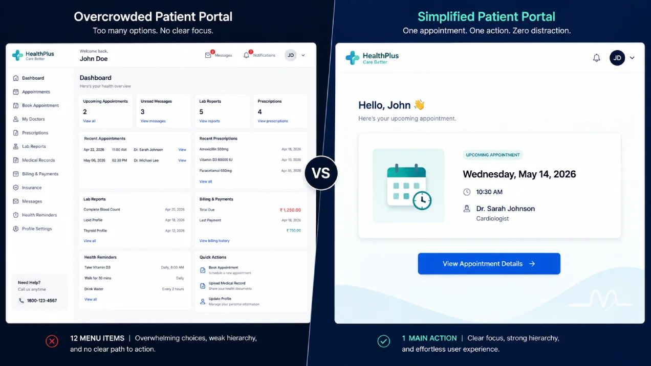
A patient landing on a portal homepage for the first time typically sees 8-12 navigation options simultaneously: appointment history, messaging, lab results, billing, prescriptions, insurance, referrals, and health records. The cognitive load at the exact moment they need clarity most drives immediate exit.
The patient portal dashboard design fix and patient portal onboarding flow: redirect first-time logins to a stripped onboarding experience, not the full dashboard. Show one card and one action.
If the patient has an upcoming appointment, the screen shows that card and one button: “Confirm appointment.” If there is a pending lab result, show that. If nothing is pending, show a welcome card with one prompt: “Complete your health history.”
After the patient completes the first action, show the full dashboard on the next login. Measure this with activation rate: the percentage of registered users who complete at least one action within 7 days of registration. Activation rate, not registration count, is the metric that reflects real patient portal adoption.
Pattern 2: The Unbroken Appointment Booking Loop
Appointment booking is the portal’s highest-intent action and the most frequently broken flow. A patient selects a slot, confirms, gets redirected to an external payment gateway or a separate login, and the session fractures. They call the front desk instead.
The fix is a single unbroken flow: slot selection, confirmation of patient and insurance details, payment if required, and a final confirmation screen with a calendar download link. All of this happens without leaving the portal or opening a new tab. No separate session. No confirmation delivered only by email. No “go back to the main menu to see your appointment.”
Track the booking flow at this step with appointment completion rate: the percentage of patients who begin the booking flow and reach the confirmation screen.
In Skymoon’s experience auditing healthcare digital properties, the drop-off between slot selection and confirmation screen is frequently the single largest abandonment point on the portal, and it is almost always a flow-interruption problem, not a patient motivation problem.
[SKYMOON INFOTECH ANALYSIS] In healthcare portal audits we have conducted, the most common cause of booking abandonment is a forced redirect to a third-party payment gateway with a different visual identity and no “back” path.
Patients interpret the visual break as a security risk and exit. Keeping payment inside the portal session eliminates that interpretation.
Pattern 3: The Patient-Tuned Login Session
Session timeouts were engineered for shared clinical workstations, not patient browsers. A 15-minute timeout makes sense for a terminal in a shared clinical room. Applied to a patient checking a result on their phone on the way home, it produces frustration, a re-login attempt, a forgotten password, and abandonment.
Patient portal login problems are almost universally caused by four decisions made for clinician contexts and applied unchanged to patients: forced password complexity without password-manager support, MFA flows that require a smartphone (not all patients have one), separate credentials per facility in multi-location networks, and the 15-minute session timeout. Fix each one:
- Session: 30 days on mobile (re-auth on new device), 7 days on desktop. Apply step-down timeouts, not a hard cutoff.
- Login: email or phone number as identifier, not username. SMS OTP or email OTP as primary login method. Biometric unlock on mobile.
- Password: allow password manager autofill (do not block paste). Password reset via email or SMS, not security questions.
- Multi-location: single credential across all facilities in the network. The patient should not know which EHR system each facility uses.
Pattern 4: Plain-Language Results
A lab result showing “ALT 45 U/L (ref: 7-56 U/L)” meets the legal requirement to give patients access to their results. It does not meet the patient’s need to understand what to do with the information.
The design fix for this pattern: pair every abnormal result with an automatically generated plain-language explanation. Keep it under 40 words. Use sentence-case and everyday vocabulary: “Your liver enzyme is slightly elevated.
This can happen after exercise or with some medications. Your doctor will review this at your next visit.” Add a within-portal “What does this mean?” link that explains the result in context., a within-portal explanation page.
Add a “Questions for your doctor” prompt pre-loaded with contextually relevant questions. If a result is flagged, suggest: “Have you started any new medications?” or “Did you have any recent illness?” The patient arrives at their appointment prepared rather than anxious. Perceived lack of need collapses when the portal surfaces something genuinely useful between visits.
Pattern 5: WCAG AA Accessibility from the First Wireframe
In the United States, HHS Section 504 (updated May 2024, deadline extended to May 11, 2027 for healthcare organizations with 15 or more employees by an Interim Final Rule issued May 7, 2026) requires patient portals to meet WCAG 2.1 Level AA.
In the European Union, the European Accessibility Act applies. In India, there is currently no equivalent accessibility mandate; position accessibility as reach, trust, and inclusion rather than compliance for India audiences.
[LEGAL NOTE] The above is general information and not legal advice. Requirements vary by jurisdiction, organisation type, and funding source. Consult qualified legal counsel for your specific compliance obligations.
Specific patient portal accessibility WCAG 2.1 AA requirements that most implementations fail on: See the WebAIM WCAG 2 checklist for a complete implementation guide:
Your website might be losing customers before they even scroll
Slow load times, confusing navigation, and weak calls to action quietly cost businesses real revenue every month. See exactly what yours is missing.
No commitment, just a clear picture of where you stand.
| Requirement | Common Failure | Correct Implementation |
|---|---|---|
| Colour contrast (1.4.3) | Light grey text on white background, typical for “secondary” information | Minimum 4.5:1 ratio for body text. Use a contrast checker before shipping any palette. |
| Form error identification (3.3.1) | Error shown only in red text (colour-only) | Error must appear in red text AND an icon AND a text description above the form |
| Labels for inputs (1.3.1) | Placeholder text used instead of a label; disappears on focus | Every input has a persistent visible label. Placeholder is supplementary only. |
| Keyboard navigation (2.1.1) | Dropdowns and date-pickers not reachable by tab key | Full portal usable with tab, shift-tab, enter, escape, and arrow keys only |
| Focus indicators (2.4.7) | Browser focus ring overridden by CSS for aesthetic reasons | Visible focus indicator on every interactive element. Never hide the focus ring. |
| Screen reader labels (1.1.1) | Lab results tables have no column headers or aria-labels | All tables have th elements with scope. All charts have table equivalents. |
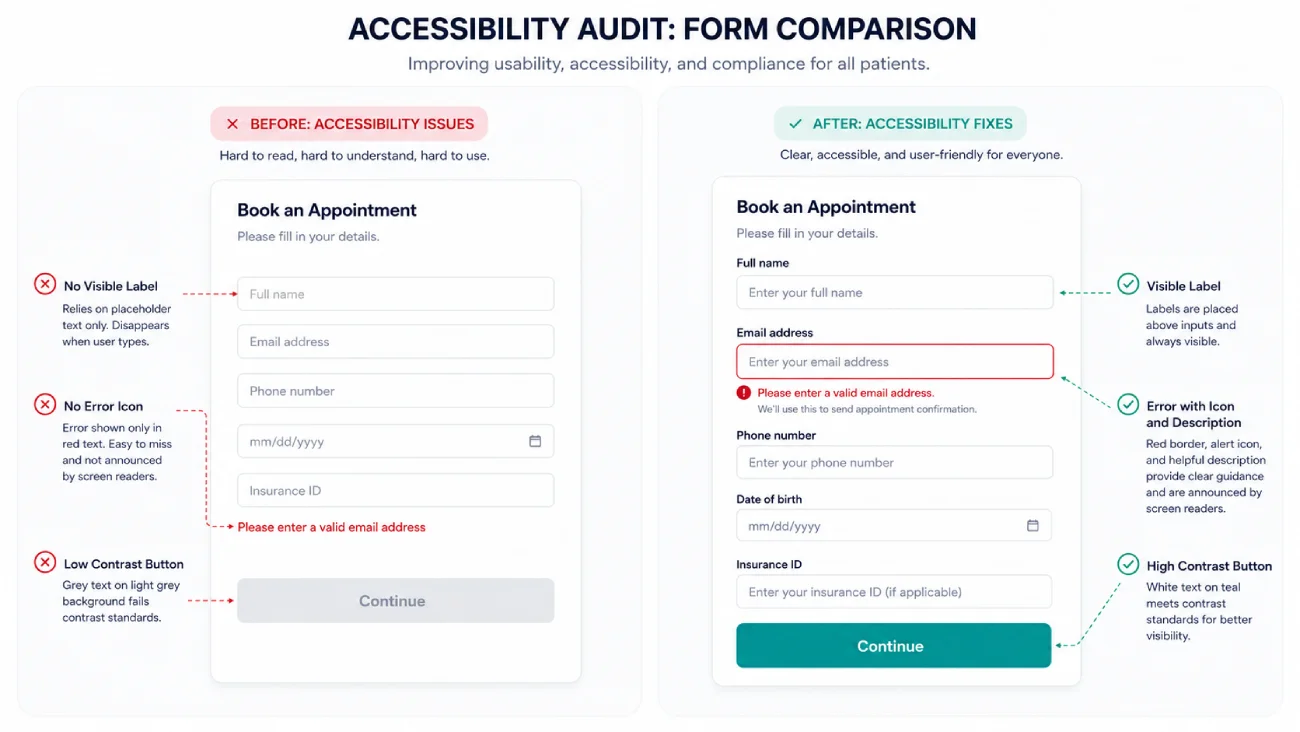
Right – same form with visible label above input, error shown with red border plus alert icon plus description text, high-contrast teal button. Healthcare UI, annotation arrows pointing to each fix.
Pattern 6: ABDM and ABHA Integration (India)
India’s Ayushman Bharat Digital Mission (ABDM) has created over 640 million ABHA IDs (14-digit unique health identifiers) as of early 2026, with the ecosystem moving from voluntary to operationally expected adoption in most states. Major hospital chains, state governments, and insurance providers are increasingly requiring ABHA-linked digital records as a prerequisite for empanelment and claims processing.
For a patient portal, ABDM integration means three functional additions: first, enabling patients to create or link their ABHA ID during the portal registration or check-in flow; second, displaying consented health records from any ABDM-linked facility in the patient’s record (prescriptions, lab reports, discharge summaries from network hospitals they visited before registering with you); third, presenting the patient’s consent controls so they can see who has accessed their records and revoke access per record type.
The network-portability argument is the strongest adoption driver for multi-location networks. A patient visits any clinic in a 15-location network and finds their complete history already loaded in the portal, not spread across 15 separate logins. That removes the perceived-lack-of-need barrier entirely for patients who have been to multiple locations.
Pattern 7: The Return-Visit Loop
Portal engagement drops to zero between appointments. A patient logs in, confirms an appointment, and has no reason to open the portal again until the next visit reminder arrives by SMS or email, from outside the portal. The portal becomes a passive record store, not an active care tool.
The return-visit loop design: send appointment reminders as in-portal notifications, not only via SMS. Create a pre-visit checklist that the patient must complete inside the portal within 48 hours of their appointment: updated insurance, current medications, recent symptoms.
This requires the patient to log in between visits and completes a useful task in the same session. Measure 30-day return rate: the percentage of activated patients who log in again within 30 days of their first session.
Pair with asynchronous messaging: a patient can submit a question about their upcoming appointment inside the portal and receive a response within 24 hours. This establishes the portal as a communication channel between visits rather than a passive repository.
Message deflection rate (the percentage of administrative queries handled inside the portal rather than by phone) is the metric that connects patient portal engagement to operational cost reduction.
Pattern 8: Visible Privacy Controls
Privacy concerns are the fourth most-cited barrier in the evidence base. Most portals bury consent controls six levels deep in a settings menu. A patient who sees a notification that their records have been shared and cannot find where to manage that access concludes the portal is unsafe and stops using it.
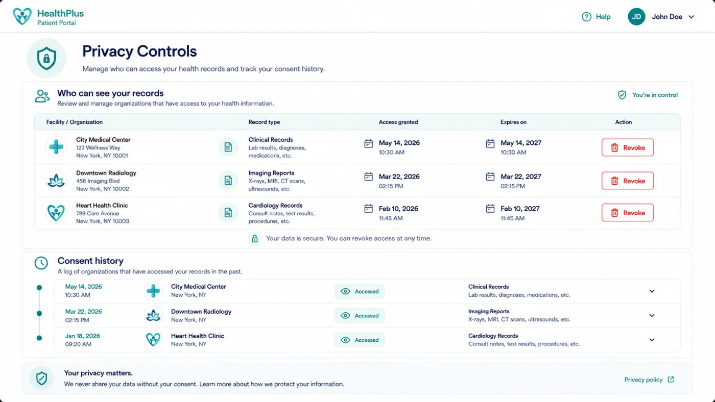
The fix: a persistent “Privacy and Consent” link in the primary navigation, not inside settings. On the privacy page, show a clear list of which facilities and practitioners have access to which record types and when that access expires.
Add a consent history: “General Hospital accessed your discharge summary on 12 March 2026 for your knee injury.” Let patients revoke specific access grants with one tap. Transparency converts distrust into engagement.
Mobile Patient Portal Design: India-Specific Constraints
In India, the majority of portal traffic arrives via mobile devices, frequently on 3G networks with intermittent connectivity. A portal built for desktop broadband fails this audience systematically.
Mobile-first patient portal design checklist for India:
- Initial page load under 2 seconds on 3G. Test with Chrome DevTools throttled to “Slow 3G” before every major release.
- Cache the appointment summary and latest result for offline access. A patient on a flight or in a rural area with no signal should still be able to see their upcoming appointment.
- Minimum 48px tap targets on all interactive elements. The standard 24px target is unusable with a thumb on a moving bus.
- No multi-step forms on mobile. Break multi-field forms into one field per screen.
- Progressive loading: show the appointment card first. Load medical history and documents on scroll or on demand.
- Vernacular support: offer a language toggle for Hindi, Tamil, Telugu, and Kannada at minimum. Medical terminology should show side-by-side plain-language translations in the selected language. Patients should be able to toggle language mid-session without losing their place.
- ABDM authentication options: include Aadhaar OTP and mobile OTP as ABHA verification methods, since not all patients have internet banking access for the Aadhaar biometric route.
[SKYMOON INFOTECH ANALYSIS] Low-bandwidth design is almost never prioritised in patient portal specifications produced for urban hospital networks. The assumption is that patients have reliable broadband access.
In Skymoon’s healthcare digital work, this assumption fails for a significant proportion of patients across Tier 2 and Tier 3 cities in India. Designing for the worst-case connectivity scenario also improves the experience for all users on congested urban networks.
Patient Portal Usability: Metrics That Reflect Real Adoption
Most portals report registration numbers to leadership as their primary adoption metric. This is a vanity metric. A portal with 100,000 registrations and a 46% activation rate has 54,000 people who signed up and never came back; this is the current average, per the AJMC 2026 data. Federal data from HealthIT.gov confirms that while 77% of individuals are now offered portal access, only 65% actually access it, and fewer still become regular users.
These four metrics reflect real patient portal usability and adoption:
| Metric | Definition | What It Measures | Target Direction |
|---|---|---|---|
| Activation Rate | % of registered users who complete ≥1 action within 7 days | Whether the onboarding experience converts registration to engagement | Higher is better. Benchmark varies; track yours over time. |
| 30-Day Return Rate | % of activated users who log in again within 30 days of first session | Whether the portal has a reason for patients to return between visits | Higher is better. Correlates with no-show reduction. |
| Appointment Completion Rate | % of patients who begin booking flow and reach confirmation screen | Whether the booking UX is frictionless or broken | Higher is better. Track drop-off by step. |
| Message Deflection Rate | % of administrative queries handled in-portal vs by phone | Whether the portal reduces front-desk load | Higher deflection = lower operational cost. |
For measurement methodology, how we measure on-site behaviour covers session recording and heatmap analysis applied to healthcare digital properties. For the acquisition funnel upstream of the portal, the healthcare CRO audit checklist covers conversion optimisation at the pre-registration stage.
If your portal activation rate or 30-day return rate is below your expectations, a structured portal UX audit identifies the specific pattern failures driving the gap. Turn portal visits into booked appointments; Skymoon’s healthcare CRO service covers portal UX alongside the wider digital patient journey.
How to Increase Patient Portal Adoption: Implementation Sequence
Adoption improves when three things happen together: signup occurs at the point of care (not by email link sent days after discharge), the first login has one obvious action, and there is a reason to return between visits. Implementing any one without the other two produces a ceiling effect.
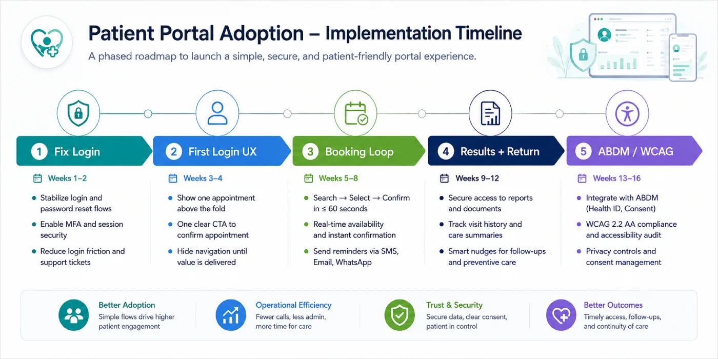
Recommended implementation sequence for a portal rebuild or redesign:
- Phase 1 (Weeks 1-4): Fix the login flow. Implement email/phone OTP login, extend session to 30 days mobile, remove password complexity forcing. This is the highest return-per-effort fix in the list.
- Phase 2 (Weeks 5-8): Build the single-action first login. Instrument activation rate tracking before starting so you have a baseline.
- Phase 3 (Weeks 9-14): Build the appointment booking loop end-to-end with payment inside the session. Instrument appointment completion rate by step.
- Phase 4 (Weeks 15-20): Add plain-language result explanations and pre-visit checklists. Instrument 30-day return rate.
- Phase 5 (Weeks 21-28): ABDM integration (India) or WCAG AA audit and remediation. Both are non-trivial engineering tasks. Sequence them after the UX fundamentals are stable.
Clinical workflow observation, not standard user interviews, is the most reliable research method for patient portal design. Watching a patient navigate the portal during a clinical visit, with a researcher observing without intervening, surfaces friction that a post-visit survey or focus group does not. The patient’s natural behaviour in the clinical context reveals assumptions they cannot articulate in an interview.
[SKYMOON INFOTECH ANALYSIS] We have found that patients who are enrolled in the portal at the point of care – while they are physically at the registration desk – show 3-4x higher activation rates than patients who receive a signup email after the visit.
The desk-based enrollment is a 90-second interaction. The email link competes with everything else in the patient’s inbox that day.
Frequently Asked Questions
Why don’t patients use their patient portal?
A common search question asks: why don’t patients use their patient portal? Evidence from a nationally representative survey (NCBI PMC, weighted n=254,183) shows the top barriers are preference for in-person communication (64%), perceived lack of need (49%), digital literacy gaps (26%), privacy concerns (21%), and login difficulty (19%).
Each of these is a design problem, not a patient problem. Well-designed portals reduce all five barriers.
What makes a good patient portal design?
A good portal is organised around what a patient needs to do: view results, book an appointment, pay a bill, send a message; not around hospital department structure.
Ready to turn this into an actual growth plan?
Our team builds strategies across SEO, paid advertising, AI search visibility, and website performance, matched to your budget and your goals, not a generic package.
- A real thirty minute call, not a sales pitch
- Recommendations specific to your business
- A short list of what to fix first
It uses plain language instead of clinical codes, meets WCAG 2.1 AA accessibility standards, works on 3G mobile, and integrates with ABDM in India so records are portable across facilities.
How do you increase patient portal adoption?
Adoption increases when three things combine: registration happens at the point of care rather than via an email link sent after the visit, the first login has one clear action rather than 12 menu options, and there is a reason to return between visits (appointment reminders inside the portal, pre-visit checklists, asynchronous messaging). Measure activation rate and 30-day return rate, not registration count.
Do patient portals need WCAG AA compliance?
In the US, HHS Section 504 requires WCAG 2.1 Level AA for patient portals of healthcare organisations receiving federal funding; deadline extended to May 11, 2027, for organisations with 15 or more employees, by HHS Interim Final Rule issued May 7, 2026. In the EU, the European Accessibility Act applies.
India currently has no equivalent mandate; position accessibility as reach and trust. This is general information, not legal advice.
Why is my patient portal login so difficult?
Common causes: password complexity rules that block password manager autofill, MFA that requires a smartphone when not all patients have one, separate credentials for each facility in a multi-location network, and session timeouts set for clinician workstations (15 minutes) rather than for patients.
The fix for each: allow OTP login, extend mobile sessions to 30 days, unify credentials across facilities, and enable biometric unlock on mobile.
What is the difference between a patient portal and a patient app?
A portal is typically a browser-based interface tied to a specific EHR system at a specific provider. An app is a standalone product with push notifications, device integrations, and often the ability to aggregate records from multiple providers.
Many Indian hospital networks run both and create a fragmented experience. Consolidate when the app and portal overlap in functionality and split the patient’s attention.
How much does a patient portal cost to build in India?
A single-facility portal with core features (appointments, messaging, lab results, billing) ranges from approximately Rs 15-30 lakh, depending on EHR integration complexity. Multi-location networks add 30-50% to that base.
ABDM/ABHA integration adds further complexity and typically 4-8 weeks of development time. Cost drivers are EHR integration depth, number of locations, compliance scope, and whether you are building on a platform or from scratch. Contact us for a scoped assessment before committing to a budget figure.
What should be on a patient portal homepage?
The homepage should show: next upcoming appointment with confirmation status, most recent lab result with plain-language interpretation, outstanding balance if any, and one primary action button relevant to the patient’s current situation.
Everything else goes behind navigation. The guiding principle: the homepage should never require a patient to read more than five elements to know what to do next.
Evaluating Your Portal Rebuild
A patient portal redesign is a 4-6 month engagement if built properly. The order of implementation matters. Fix login first, then first-login UX, then the booking loop, then the return-visit mechanisms. Accessibility and ABDM integration are last; not because they matter less, but because they are harder to do well on an unstable UX foundation.
If you need to assess where your current portal sits before committing to a rebuild scope, the the fundamentals of UX-driven conversion provides the baseline framework, and the healthcare web design services page outlines how Skymoon approaches portal audit and redesign engagements.
Let's turn this into results for your business.
SEO, paid advertising, AI search visibility, website design, and conversion optimization, all under one roof, all pointed at the same goal: revenue.